The right way towards innovation
Our signage for the new building of Flanders Make
With great enthusiasm, we designed all signage and icons for the brand-new facility of Flanders Make in Kortrijk. Every visitor now navigates flawlessly through this beautiful building. And with a sharp twist, we made walls, corridors, doors and classrooms breathe innovation and technology!

Flanders Make kantoor
In a building, how do you draw attention to signage? And how do you guide a visitor flawlessly through the tangle of rooms and floors? With attention to recognizability and a nod to minimalism, each floor and meeting room was given its own technological twist.
Visible innovation through signage
Volta makes innovation come alive. For years we have been shaping the annual report for Flanders Make, the research center around innovation in the manufacturing industry. In its latest editions, it announced the construction and opening of their new top technology center in Kortrijk. With great pleasure we put ourselves at the drawing table and worked out the signage for this magnificent building.
Brand identity of a building
Designing the signage of a building: it is a question we took on with enormous enthusiasm. Such a signalization is not just a signpost and ground plan, it also gives a (brand) identity to a building. And brand identity is exactly what we excel at! In-depth discussions with the Flanders Make team allowed us to work out our first concepts.
Logical routes and landmarks
Our visual approach was soon known. We wanted the entire building to radiate innovation from the moment you step inside. All elements of the signage had to take the visitor on a colorful and dynamic journey through technological ingenuity. But of course this also had to be a journey that takes you neatly from point A to B: without detours and via logical routes and landmarks.

Flanders Make Signalisatie


Flanders Make Control Room
Smart iconography, familiar look
Above all, our signage needed to be recognisable and therefore not overwhelming. We breathed life into the site through a sophisticated mix of house style colours and smart iconography. We took our inspiration from the furniture and fittings in the building: a mix that immediately created a familiar look, together with the corporate colours. Through clean lines and custom-made minimalist icons, we added a touch of modernity to every sign.
Clear map, clear directions
You are welcomed with an overview of the floors and arrows pointing you in the right direction. Signs then guide you to important areas such as meeting rooms, lifts and garages. Doors are marked with clear indications and with angled signage you can find functional areas such as toilets and meeting rooms in the blink of an eye.

Flanders Make signalisatie

Flanders Make signalisatie

Flanders Make signalisatie
One colour per floor
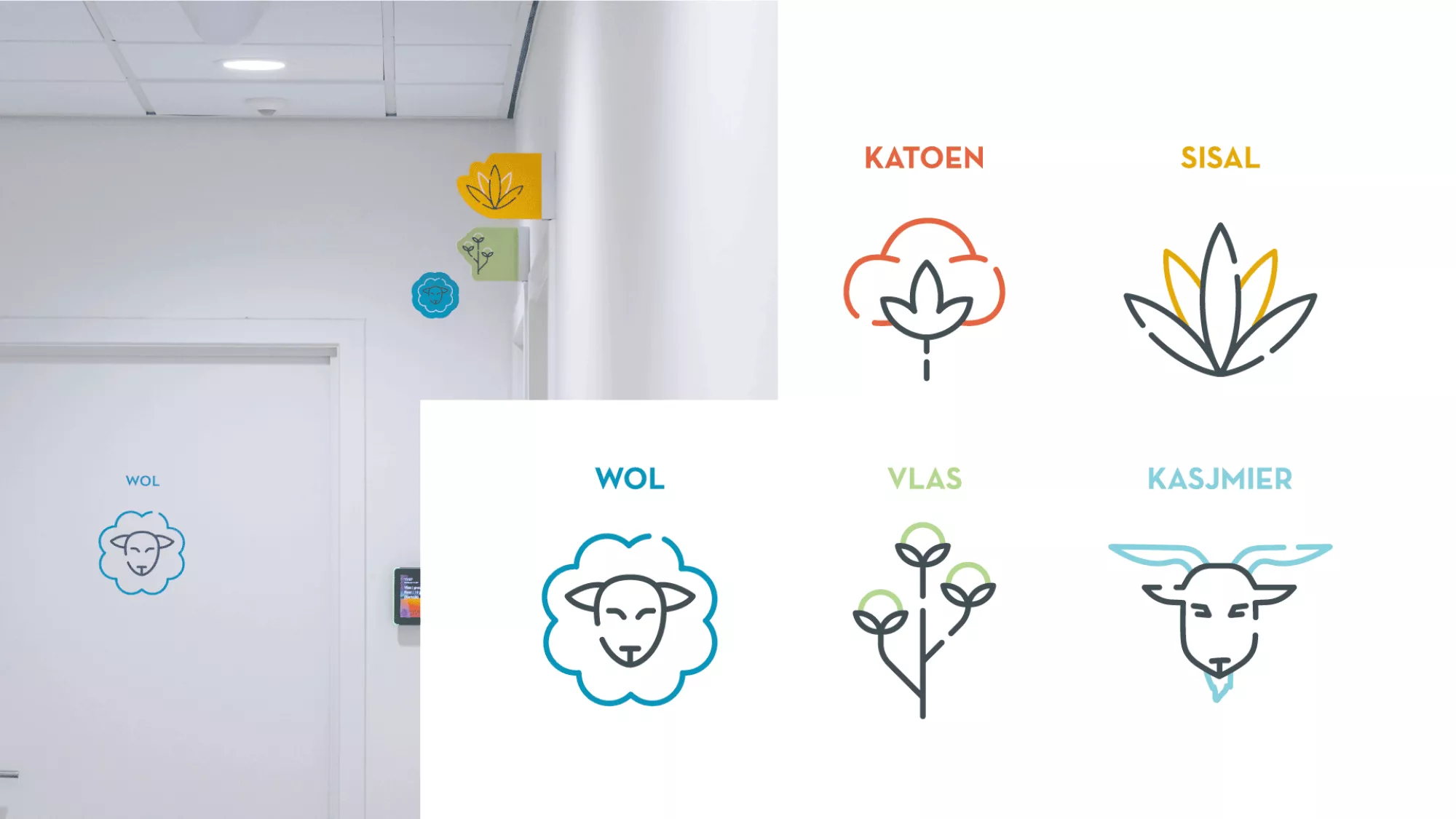
Each floor has its own colour code, so you know at a glance where you need to be - and where you currently are. And the meeting rooms? Those each have their own custom icon, perfectly matching their name. Think ‘Wol' (wool) with a cute little sheep, ‘Inspiratie’ (inspiration) with a sparkling lamp, and ‘Kasjmier’ (cashmere) with a sweet little goat.
We even designed the letterbox
Just when we thought the whole signage project was finished, we received perhaps the most original question we had ever been asked. After all, Flanders Make did not yet have a letterbox for the building. The assignment was wide open: we had to design a complete one from scratch, including the choice of materials. Our graphics department was inspired by the geometry, character and interplay of shapes of the new building. So the letterbox consists of two large, steel block shapes, fixed on a concrete base. Very handy for the many parcels delivered there!

Flanders Make signalisatie


Flanders Make Signalisatie
Flanders Make?
Flanders Make is a strategic research centre in Flanders that focuses on innovative technologies for the manufacturing industry. The centre supports companies in the development of products and production processes to increase their competitiveness. Flanders Make collaborates with industry and academic institutions to share knowledge and expertise.