Building bridges between man and machine
volta brings the Vlaamse AI Academy to life
Vlaamse AI Academie or VAIA wants to educate professionals and researchers in Flanders on artificial intelligence (AI). This required a complete branding and matching corporate identity. Volta delved into the many bits and bytes at the speed of light. This is how we came up with a clear brand story and its visual interpretation, including animation video, aight!
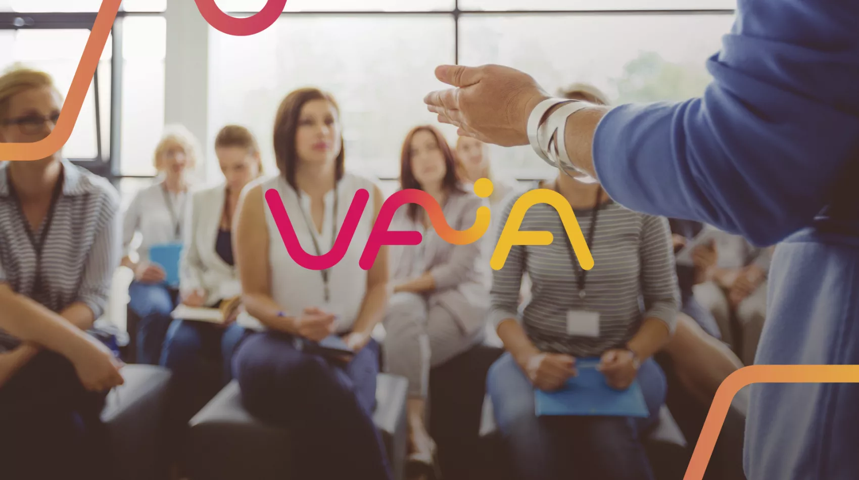
Flowing and connecting, like an unbreakable link between man and machine: that's how VAIA presents itself. So on that note, we also made the logo and visual style blend seamlessly!
Workshop brand identity
Starting from a blank page, we first invited the entire VAIA team to a brand identity workshop. In it, we used some reliable techniques to determine the brand's vision and mission, which in turn formed the basis for the vibrant corporate identity we had to design. That corporate identity is fully reflected in the logo, which focuses on the human, connecting and technological character of the organisation.
Fresh, vivid corporate identity
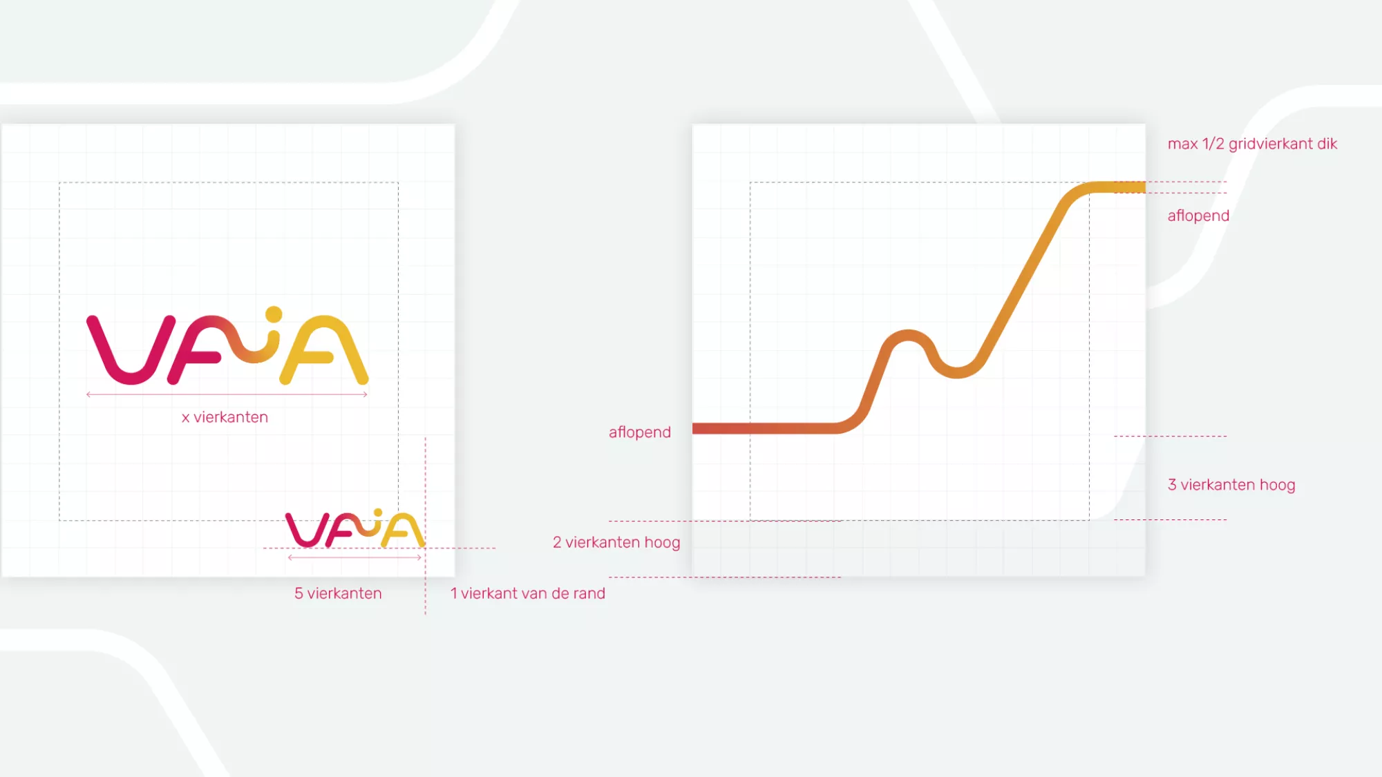
After consulting the client, we came up with a fluid and seamless corporate identity that links man and machine as an aesthetic binder. The fresh and vibrant corporate identity immediately stands out because of the curved logo: a continuous flow that seeks the boundary between logo and textual brand. We also visually reinforce the smooth and intuitive interaction that arises between man and machine by using the striking primary colours red and orange that blend into each other via a gradient. We didn't just choose passionate colours like red and orange: we necessarily wanted to counterbalance the typical green-blue colour scheme that often sticks to technology companies.
Our philosophy of this corporate identity? The logo bridges the abstract world of machines and human aesthetics. As a result, it also reinforces the understanding, acceptance and use of AI. Technology and humans thus blend harmoniously into one: a common language that can be understood by both!

Website
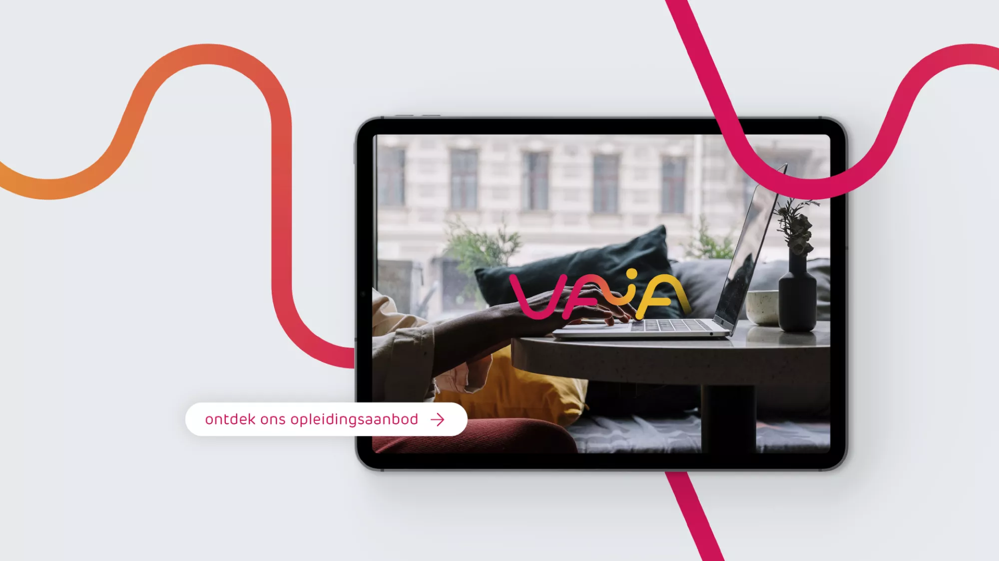
As a full-service communication agency, we also took care of VAIA's website. It became a clear website with more corporate accents, where we continued the flowing element from the logo into the design. Again, this element is an aesthetic representation of the link between man and machine. The clean iconography and the primary colour palette with red and orange add a fiery touch to the experience and make the website feel very dynamic.

Animation with an AI twist
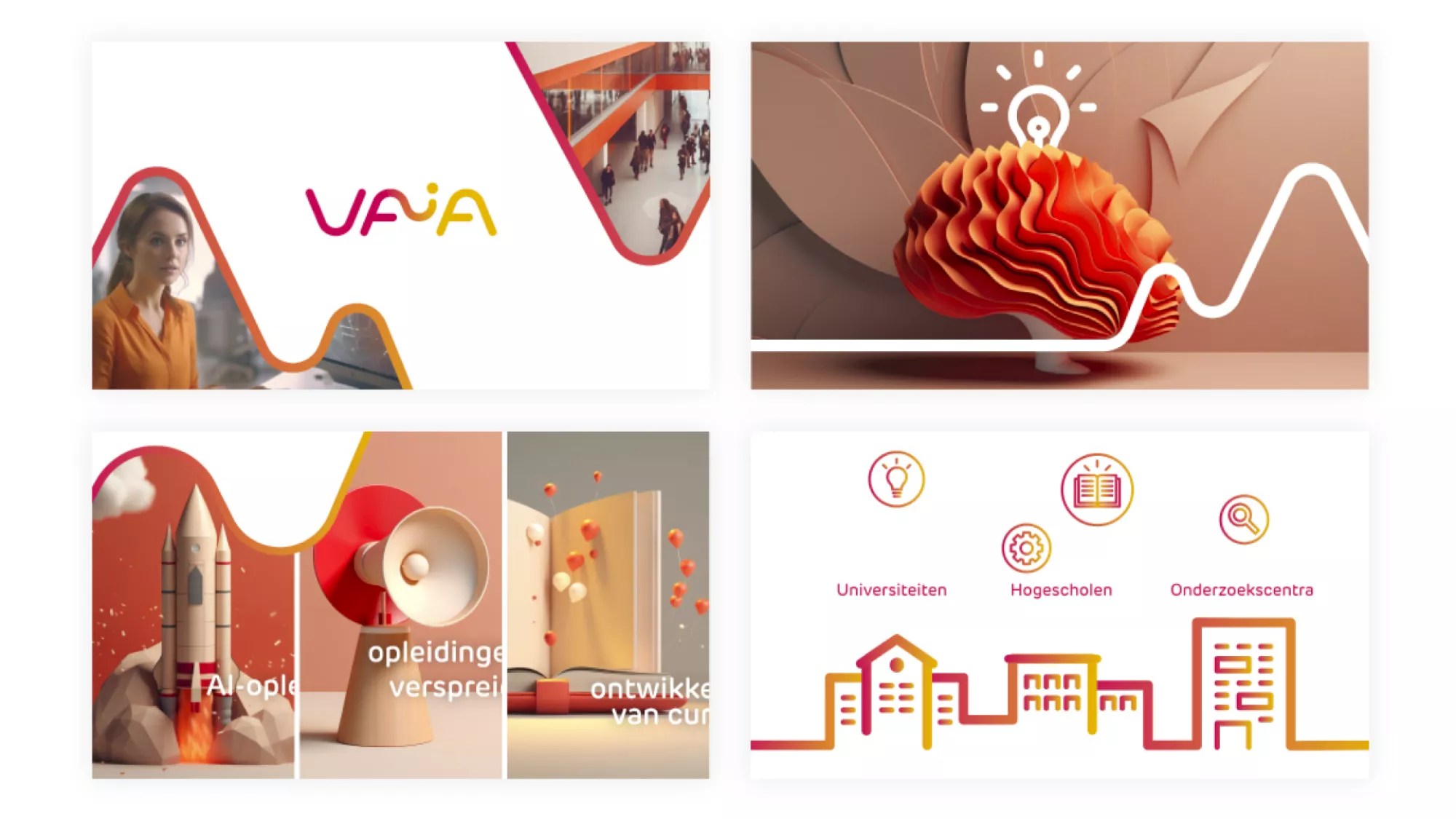
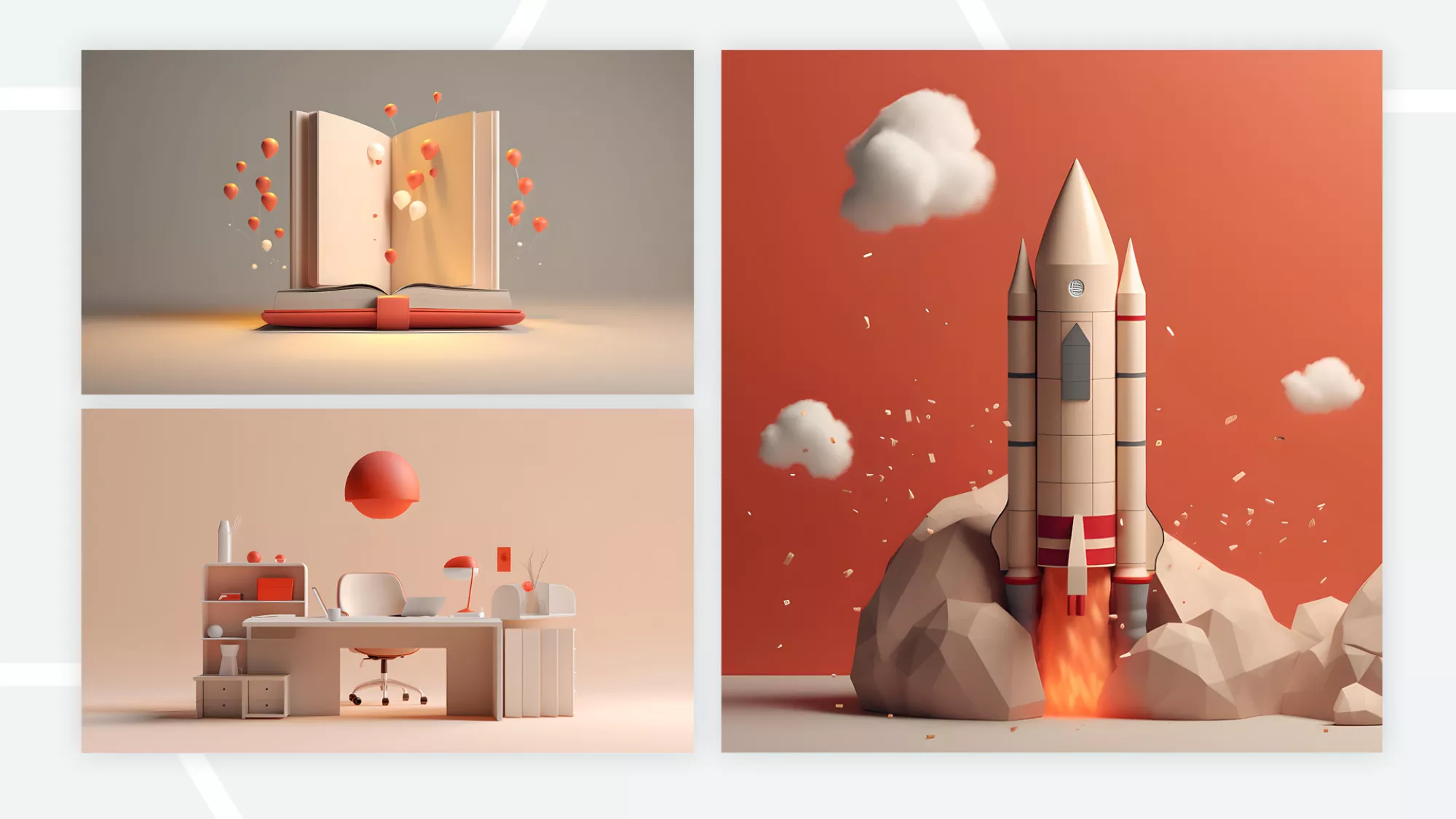
VAIA also approached us to create an animation video to promote their AI courses. In line with the nature of the courses, we decided to use AI as a tool for the design as well. By experimenting with various styles and prompts in Midjourney, we found the perfect look that fit seamlessly with VAIA's corporate identity. With this, we shaped the visuals and brought together the carefully designed elements into a balanced animation video.

VAIA?
Vlaamse AI Academie or VAIA is a collaboration of all Flemish universities and colleges and aims to upskill professionals and researchers in Flanders around artificial intelligence (AI).